深入解读 Uniswap v3 的投资策略选择。
**撰文:**ck.eth
编译:Lylia
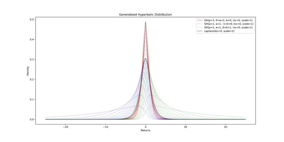
双曲分布[1],最初是为了模拟风沙波动[2](沙漠中的沙子动态)而开发的,由于其参数的灵活性[3], 在建模金融资产回报方面具有应用。
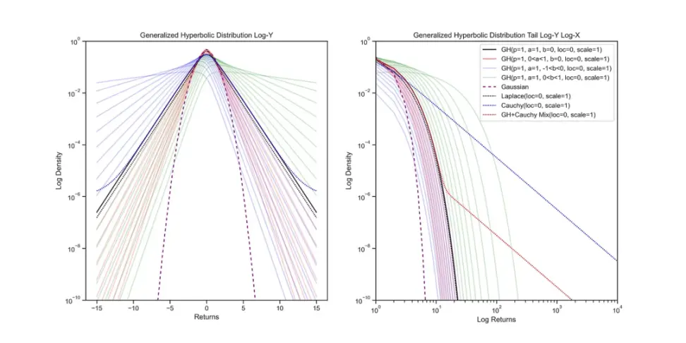
左图:在对数 - 纵坐标图上观察统计分布可以更好地了解其形状。超博拉分布呈现出类似于双曲线的形状,而虚线高斯分布由于 e^-x²/2 项的存在可以看作是一个抛物线。右图:通过在对数 - 对数图上观察分布的尾部,可以更好地了解其特征。幂律分布在对数 - 对数图中不会呈现出衰减的趋势。可以通过将分布组合并使用权重参数来混合不同的分布。
数字资产的价格行为
对于流动性提供者(LP)来说,了解自己资产的价格动态是非常有用的。如果我们在以对数 - 纵坐标图的形式观察自 2015 年以来最古老的数字资产比特币(BTC)的历史数据,使用了 3091 个每日收益率数据,我们会发现除了一些离群值,广义双曲线分布在历史上可以很好地拟合每日收益率。
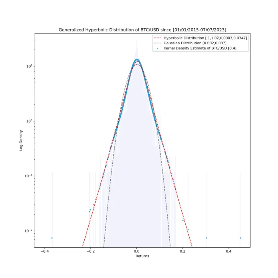
我们的拟合异常之处恰好是位于最右侧和最左侧的离群值,在对数 - 对数图中可以观察到这些值。在该图中,我们可以看到负收益率的尾部用红色表示,而正的离群收益率用蓝色表示。
尽管尾部看起来相似,但右侧的离群值存在一些不匹配。为了平滑直方图,我使用了核密度估计(KDE)方法。
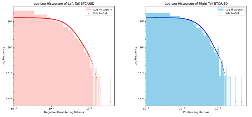
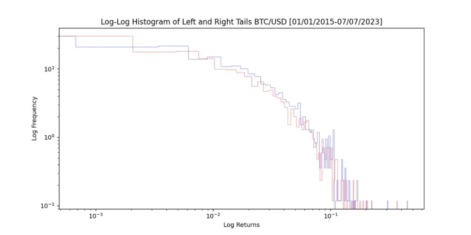
自 2015 年 1 月 1 日起,比特币(BTC)每日收益率的左尾和右尾显示出不对称性,尤其是右尾。
这意味着将广义双曲线与非对称幂律结合起来可以描述比特币价格的动态。需要注意的是,我选择比特币作为示例,因为它是最古老的时间序列,同时也是所有数字资产中最不易波动的,这意味着其他数字资产的流动性提供者(LPs)将表现出更加波动的行为。
价格动态建模
有数十种统计分布可以混合使用,以模拟这种波动行为。例如,在传统金融领域中,一种常用的方法是使用几何布朗运动(对数正态分布)并将其与勒维过程(泊松分布)相结合,以考虑价格的跳跃。
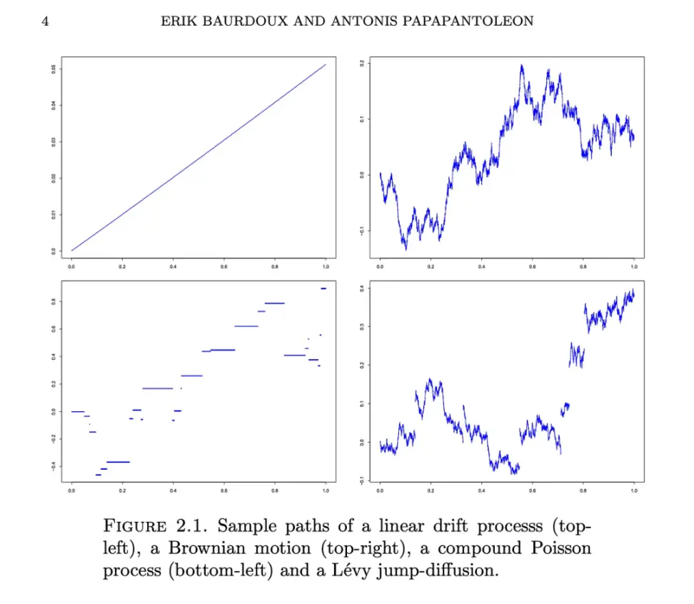
由 Erik Bardoux 和 Antonis Papapantoleon 在关于勒维过程的讲座中可视化的模拟路径。
我在 Desmos 上创建了一个包含 50 多种统计分布的库,以帮助用户探索这些分布以及如何通过 Riemann 积分在 Uniswap 上复制这些分布的 LP 头寸。
统计分布库的 Desmos 链接:
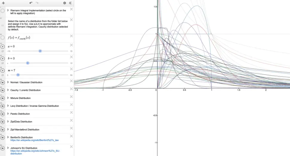
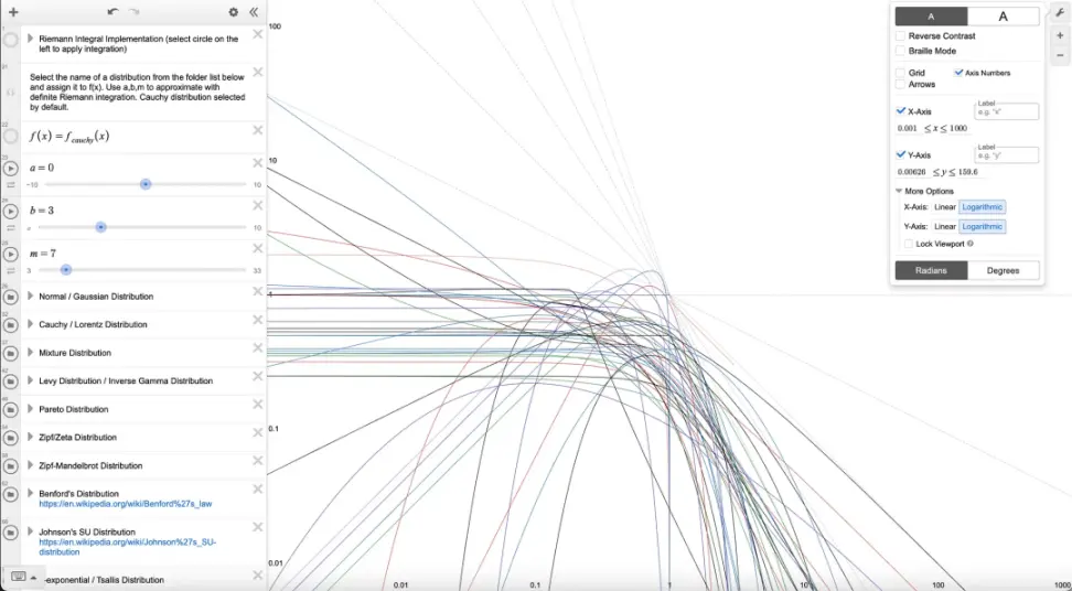
Desmos 的一个有趣特点是可以切换到对数对数图,这样可以看到每个统计分布的尾部特征是如何变化的。
如果想要比较哪种分布最适合自己的数据,可以使用 Kolmogorov-Smirnov 检验将累积分布函数与经验累积直方图数据进行比较。但是,我们也可以使用下面的一种简单方法,只需假设可能最糟糕的分布。
如果对未来的情况一无所知,怎么办呢?嗯,我们可以思考在价格空间中最差的可能分布是什么样的,即其尾部呈现无限延伸的幂律。其中一种分布就是柯西分布(在价格空间中,对应的是对数柯西分布)。
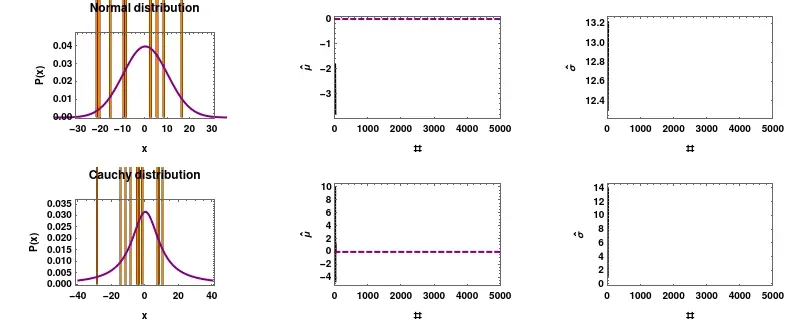
柯西分布不遵循大数定律,它拥有自己的意愿。你可以参考这个链接:_distribution#/media/File:Mean_estimator_consistency.gif,了解柯西分布的特性。
柯西分布的一个特性是它不符合大数定律。你可能会计算过去 30 天的平均值,以为你看到了一种模式,但实际上它可能欺骗你。一个有趣的例子是 DOGE/ETH 交易对的平均值,由于缺乏流动性,它可能表现出这种行为。
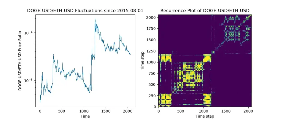
尽管 Dogecoin 和 Ethereum 已经存在了 7 年以上,但这对交易对的跳跃过程却有自己的特点,这使得应用统计近似方法变得困难。
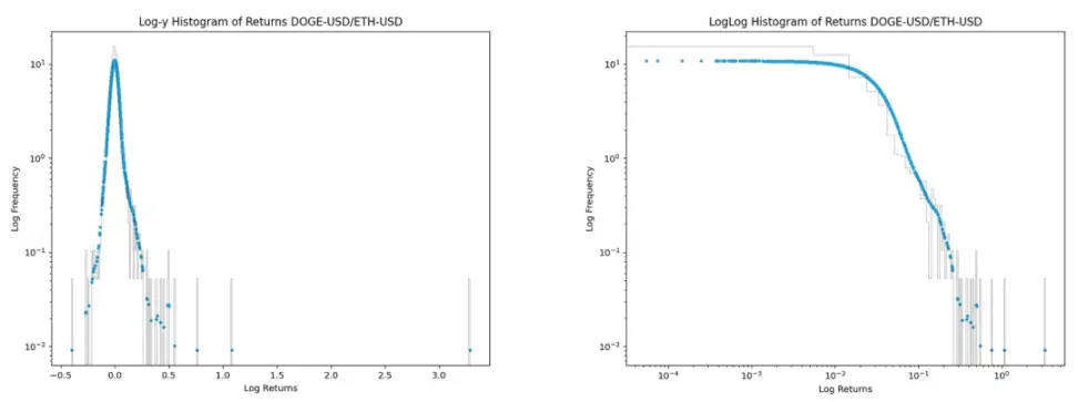
右侧的 loglog 直方图中存在逐渐增长的离群值。我了解到,在 loglog 图中具有逐渐增长离群值的分布是对数柯西分布。
我们可以看到柯西分布在价格空间中相对于对数正态分布的样子。
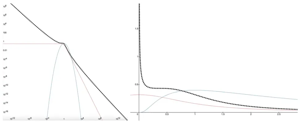
左侧: 对数正态分布的 loglog 图形呈抛物线状,红色表示柯西幂律的线性尾部,黑色虚线表示对数柯西分布 右侧: 同样的分布在价格空间中的表示,范围从[0,无穷大 )。
对数柯西分布并不像完全范围的 Uniswap v2 仓位那样糟糕,但它是第二糟糕的情况。根据我们在第 1 和第 2 部分对于资本效率优化的知识,将下限设定在 80-90% 左右可以帮助改善它,因为随着价格接近下限,分布开始增长,因此不需要一直提供流动性直至零。
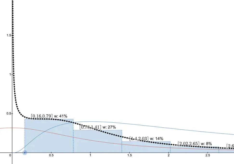
从当前价格 1 开始,将下限设定为 80-90% 可以作为限制范围的起点,但我不建议根据这样的动态来投资 / 购买 / 出售任何资产,这并不是金融建议。最佳做法是等待并更多地了解一种资产。
关于复杂系统中的幂律分布
但是,像柯西分布这样的幂律分布会随着时间的推移变得尾部较短吗?在像加密货币这样不断演化的复杂系统中,很难完全消除幂律现象(参见附录),但可以减少不确定性的程度。
仔细思考一下,所有资产在初始阶段都曾经历过不确定性的时刻。事实上,随着自动化做市商(AMM)的发展,我们发现了传统金融市场上无法预测的有趣联系。人们使用平方根定律来统计估计价格影响。通过 AMM,我们可以准确预测价格仅仅作为集中流动性的函数而受到的影响,并且无需考虑交易量或波动率来定义某个时刻的价格影响。将论点推向极端,假设 Jerome Powell 下载了 MetaMask,并决定在 DOGE/ETH 中提供流动性资金,并提供数万亿美元的流动性。每个试图出售 DOGE 的人对价格的负面影响几乎可以忽略不计,从返回分布中可以看到,随着时间的推移,波动性会下降,逐渐变得不太像柯西分布。
因此,有一个有足够资金的流动性供应商勇敢大胆地在长时间内为 AMM 提供过多流动性,就有可能降低资产的波动性。虽然我怀疑很少有人能够在手边有一个数字货币打印机来增加他们的勇气。
在没有数字货币打印机的情况下,加密货币行业克服这一问题的一种方法是引入区块链上可以给流动性供应商提供持续购买保证的资产。这些资产可能包括:大型股息生息股(为退休人员而被养老基金购买)、债券(为短期融资而被银行和企业购买)、外汇(单个全球中心化法定货币很难实现,因此人民币、美元、欧元等货币对仍将继续使用)和商品(食物和取暖将始终有需求)。作为流动性供应商,在麦当劳 / 玉米这样的交易对中提供流动性时,你会更加放心,因为你知道总会有一些需求,从而不会吓跑流动性。即使出现偏离损失,作为流动性供应商,你也可以安心,因为你将成为一群快乐餐制造商或一群玉米的所有者。
附录
关于幂律和为什么加密货币和传统金融将继续存在这种现象:
一个很好的最近例子是(2023 年 1 月 8 日)共同演化的 DeFi 系统,其中 Curve 通过 Vyper 被攻击,这反过来影响了其他协议如 Aave,进而影响了其他用户对取款的决策。零日漏洞的存在导致该系统不断演变,并处于失衡状态,产生尾事件。
这是从网上获取历史数据的代码:
import math
import numpy as np
import yfinance as yf #make sure to ‘pip install yfinance’
import pandas as pd
import matplotlib.pyplot as plt
import matplotlib.animation as animation
#Download BTC/EUR as default
ticker1=“BTC-USD” #^GSPC, ^IXIC, CL=F,^OVX, GC=F, BTC-USD, JPY=X, EURUSD=X, ^TNX, TLT, SHY, ^VIX, LLY, XOM
ticker2=“EURUSD=X”
t_0=“2017-07-07”
t_f=“2023-07-07”
data1=yf.download(ticker1, start=t_0, end=t_f)
data2=yf.download(ticker2, start=t_0, end=t_f)
data3=data1
dat=data1[‘Close’]
dat = pd.to_numeric(dat, errors=‘coerce’)
dat=dat.dropna()
dat_ret=dat.pct_change(1)
x = np.array(dat.values)
dat_recurrence=dat/max(dat)
xr = np.array(dat_recurrence.values)
fig, (ax1, ax2) = plt.subplots(nrows=1, ncols=2, figsize=(6.5,3))
Plot the logistic map in the first subplot
ax1.plot(range(len(x)), x, ‘#056398’, linewidth=.5)
ax1.set_xlabel(‘Time’)
ax1.set_ylabel(str(ticker1)+‘/’+str(ticker2)+’ Price Ratio’)
ax1.set_title(str(ticker1)+‘/’+str(ticker2)+’ Fluctuations since '+ str(t_0))
ax1.set_yscale(‘log’)
n_end=len(x)
Create a recurrence plot of the logistic map in the second subplot
R = np.zeros((n_end, n_end))
for i in range(n_end):
for j in range(i, n_end):
if abs(xr[i] - xr[j]) < 0.01:
R[i, j] = 1
R[j, i] = 1
ax2.imshow(R, cmap=‘viridis’, origin=‘lower’, vmin=0, vmax=1)
ax2.set_xlabel(‘Time step’)
ax2.set_ylabel(‘Time step’)
ax2.set_title(‘Recurrence Plot of ’ +str(ticker1)+’/'+str(ticker2))
series = pd.Series(dat_ret).fillna(0)
fig, ax = plt.subplots()
density = stats.gaussian_kde(series)
series.hist(ax=ax, bins=400, edgecolor=‘black’,color=‘#25a0e8’, linewidth=.2,figsize=(6.5,2),histtype=u’step’, density=True)
ax.set_xlabel(‘Log Returns’)
ax.set_ylabel(‘Log Frequency’)
ax.set_title(‘LogLog Histogram of Returns ’ +str(ticker1)+’/'+str(ticker2))
ax.set_yscale(‘log’)
ax.set_xscale(‘log’)
ax.grid(None)
plt.scatter(series, density(series), c=‘#25a0d8’, s=6)
fig, ax2 = plt.subplots()
series.hist(ax=ax2, bins=400, edgecolor=‘black’,color=‘#25a0e8’, linewidth=.2,figsize=(6.5,2),histtype=u’step’, density=True)
ax2.set_xlabel(‘Log Returns’)
ax2.set_ylabel(‘Log Frequency’)
ax2.set_title(‘Log-y Histogram of Returns ’ +str(ticker1)+’/'+str(ticker2))
ax2.set_yscale(‘log’)
ax2.grid(None)
plt.scatter(series, density(series), c=‘#25a0d8’, s=6)
plt.show()
双曲线分布和混合模型
import numpy as np
from matplotlib import pyplot as plt
from scipy import stats
p, a, b, loc, scale = 1, 1, 0, 0, 1
rnge=15
x = np.linspace(-rnge, rnge, 1000)
#Mixture model for tails
w=.999
dist1=stats.genhyperbolic.pdf(x, p, a, b, loc, scale)
dist2=stats.cauchy.pdf(x, loc, scale)
mixture=np.nansum((w*dist1,(1-w)*dist2),0)
plt.figure(figsize=(16,8))
plt.subplot(1, 2, 1)
plt.title(“Generalized Hyperbolic Distribution Log-Y”)
plt.plot(x, stats.genhyperbolic.pdf(x, p, a, b, loc, scale), label = ‘GH(p=1, a=1, b=0, loc=0, scale=1)’, color=‘black’)
plt.plot(x, stats.genhyperbolic.pdf(x, p, a, b, loc, scale),
color = ‘red’, alpha = .5, label=‘GH(p=1, 0<a<1, b=0, loc=0, scale=1)’)
[plt.plot(x, stats.genhyperbolic.pdf(x, p, a, b, loc, scale),
color = ‘red’, alpha = 0.2) for a in np.linspace(1, 2, 10)]
plt.plot(x, stats.genhyperbolic.pdf(x, p,a,b,loc, scale),
color = ‘blue’, alpha = 0.2, label=‘GH(p=1, a=1, -1<b<0, loc=0, scale=1)’)
plt.plot(x, stats.genhyperbolic.pdf(x, p,a,b,loc, scale),
color = ‘green’, alpha = 0.2, label=‘GH(p=1, a=1, 0<b<1, loc=0, scale=1)’)
[plt.plot(x, stats.genhyperbolic.pdf(x, p, a, b, loc, scale),
color = ‘blue’, alpha = .2) for b in np.linspace(-10, 0, 100)]
[plt.plot(x, stats.genhyperbolic.pdf(x, p, a, b, loc, scale),
color = ‘green’, alpha = .2) for b in np.linspace(0, 10, 100)]
plt.plot(x, stats.norm.pdf(x, loc, scale), label = ‘N(loc=0, scale=1)’, color=‘purple’, dashes=[3])
plt.plot(x, stats.laplace.pdf(x, loc, scale), label = ‘Laplace(loc=0, scale=1)’, color=‘black’,dashes=[1])
plt.plot(x, mixture, label = ‘Cauchy(loc=0, scale=1)’, color=‘blue’,dashes=[1])
plt.xlabel(‘Returns’)
plt.ylabel(‘Log Density’)
plt.ylim(1e-10, 1e0)
plt.yscale(‘log’)
x = np.linspace(0, 10000, 10000)
dist1=stats.genhyperbolic.pdf(x, p, a, b, loc, scale)
dist2=stats.cauchy.pdf(x, loc, scale)
mixture=np.nansum((w*dist1,(1-w)*dist2),0)
plt.subplot(1, 2, 2)
plt.title(“Generalized Hyperbolic Distribution Tail Log-Y Log-X”)
plt.plot(x, stats.genhyperbolic.pdf(x, p, a, b, loc, scale), label = ‘GH(p=1, a=1, b=0, loc=0, scale=1)’, color=‘black’)
plt.plot(x, stats.genhyperbolic.pdf(x, p, a, b, loc, scale),
color = ‘red’, alpha = .5, label=‘GH(p=1, 0<a<1, b=0, loc=0, scale=1)’)
[plt.plot(x, stats.genhyperbolic.pdf(x, p, a, b, loc, scale),
color = ‘red’, alpha = 0.2) for a in np.linspace(1, 2, 10)]
plt.plot(x, stats.genhyperbolic.pdf(x, p,a,b,loc, scale),
color = ‘blue’, alpha = 0.2, label=‘GH(p=1, a=1, -1<b<0, loc=0, scale=1)’)
plt.plot(x, stats.genhyperbolic.pdf(x, p,a,b,loc, scale),
color = ‘green’, alpha = 0.2, label=‘GH(p=1, a=1, 0<b<1, loc=0, scale=1)’)
[plt.plot(x, stats.genhyperbolic.pdf(x, p, a, b, loc, scale),
color = ‘blue’, alpha = .2) for b in np.linspace(-10, 0, 100)]
[plt.plot(x, stats.genhyperbolic.pdf(x, p, a, b, loc, scale),
color = ‘green’, alpha = .2) for b in np.linspace(0, 10, 100)]
plt.plot(x, stats.norm.pdf(x, loc, scale), label = ‘Gaussian’, color=‘purple’, dashes=[3])
plt.plot(x, stats.laplace.pdf(x, loc, scale), label = ‘Laplace(loc=0, scale=1)’, color=‘black’,dashes=[1])
plt.plot(x, stats.cauchy.pdf(x, loc, scale), label = ‘Cauchy(loc=0, scale=1)’, color=‘blue’,dashes=[1])
#Heavy tail mix model
plt.plot(x, mixture, label = ‘GH+Cauchy Mix(loc=0, scale=1)’, color=‘red’,dashes=[1])
plt.xlabel(‘Log Returns’)
plt.ylabel(‘Log Density’)
plt.ylim(1e-10, 1e0)
plt.xlim(1e-0,1e4)
plt.xscale(‘log’)
plt.yscale(‘log’)
plt.legend(loc=“upper right”)
plt.subplots_adjust(right=1)
plt.show()
